AMBROGINO CANTINA LATTICA
VISUAL IDENTITY

CLIENT: AMBROGINO
CAT: VISUAL IDENTITY
YEAR: 2024
CAT: VISUAL IDENTITY
YEAR: 2024
Ambrogino is an ice cream shop that produces and sells traditional Italian ice cream. With a genuine approach based on the excellence of ingredients, Ambrogino differs from classic ice cream parlors in the special combinations it invents, produces and on which it puts its signature.

Ambrogino's logo takes inspiration from artists' signatures. It was created by writing the name by hand, with pen and paper, as authentically as possible, and then digitized. And because no two signatures are ever the same, Ambrogino's logo also exists in multiple versions.


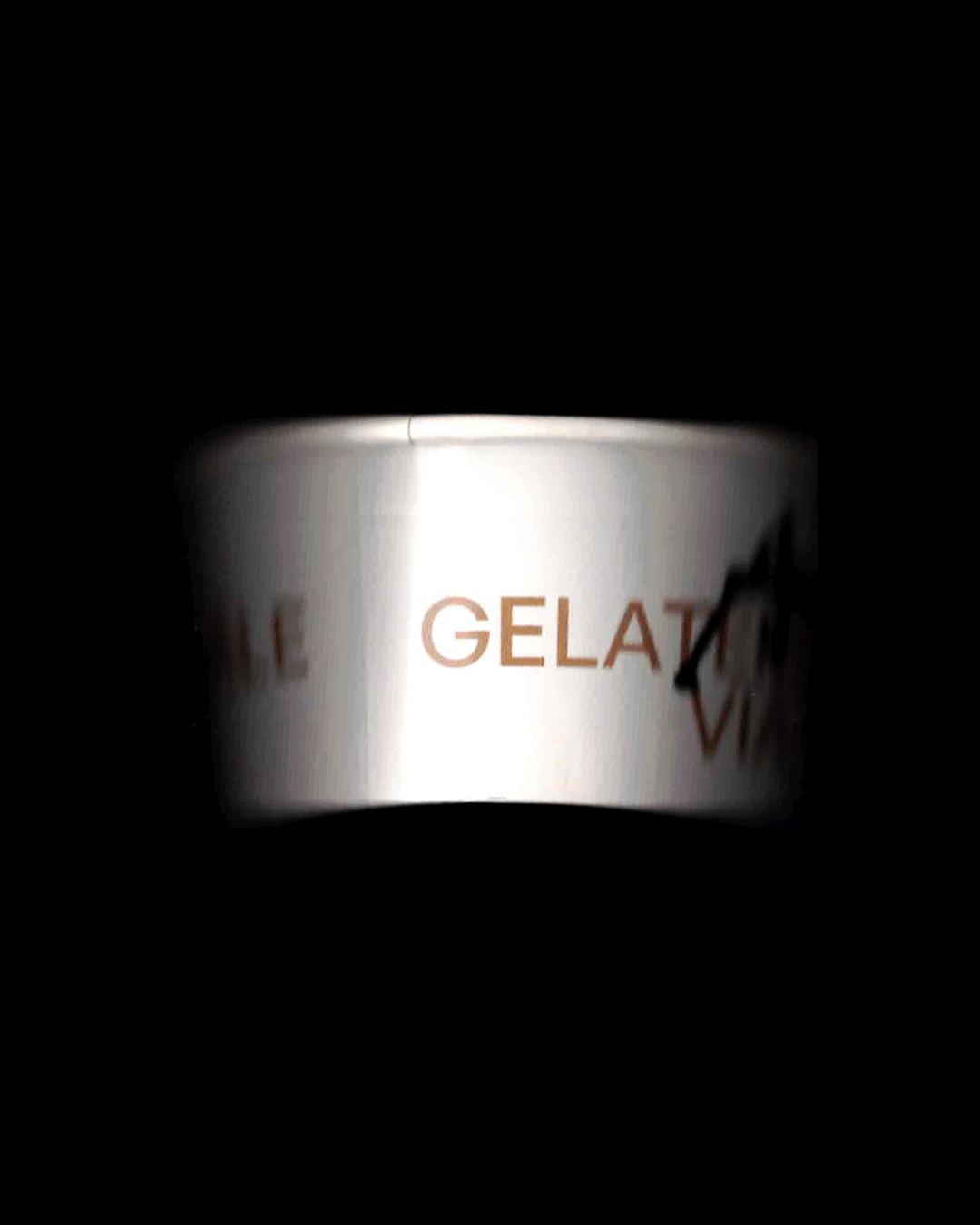
To facilitate recognition of the 3 different cup sizes, 3 different graphics were designed to allow identity to be expressed and useful.


A paper bag with a lock-up on the A of the logo was also designed. The two sides feature two different A's.


Process and identity IRL ︎︎︎


