ANDREA CASTELLETTI STUDIO
VISUAL IDENTITY - TYPE DESIGN
CLIENT: ANDREA CASTELLETTI STUDIO
CAT: VISUAL IDENTITY - TYPE DESIGN
YEAR: 2022
CAT: VISUAL IDENTITY - TYPE DESIGN
YEAR: 2022
Andrea Castelletti is a multidisciplinary creative director, specialising in the wine design sector.
He has been the winner, thanks to his work, of more than 70 international awards including 3 platinum, 9 gold and 4 silver from the “Graphis” (NYC), and an “Award of Excellence” from the “Communication Arts”.
In 2022, the year of the 15th anniversary of his career, I was in charge of the entire rebranding project, to change the positioning from “independent creative director” to “full-service design studio".
To inaugurate the new visual identity, I subsequently developed a showreel celebrating Andrea Castelletti's 15-year career and officially presenting his new graphic identity.

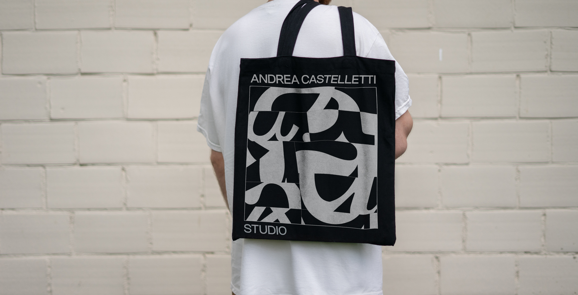
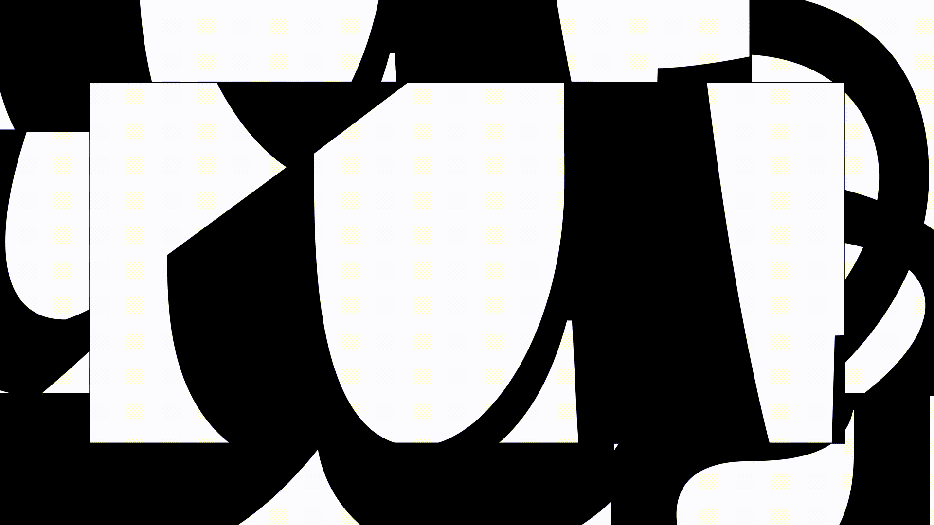
The lowercase "a" with the dot was the identifying mark of Andrea Castelletti for 15 years, his "essence".
To represent Andrea's versatility (one of the key values defined in the analysis and strategy phase) the concept of "a." has been declined in 15 different variants, thus maintaining its essence but giving it a much greater expressive force.
To represent Andrea's versatility (one of the key values defined in the analysis and strategy phase) the concept of "a." has been declined in 15 different variants, thus maintaining its essence but giving it a much greater expressive force.

The identity was designed to unite two tensions: pure rationalism on one side and visual anarchy on the other: Vignelli versus Sagmeister.
The result is a corporate identity with a very institutional and at the same time strongly identifying language, thanks to the abstract shapes that always exist in different ways on different supports.
The result is a corporate identity with a very institutional and at the same time strongly identifying language, thanks to the abstract shapes that always exist in different ways on different supports.


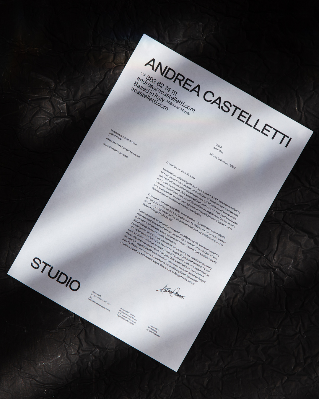
Business cards printed on Fedrigoni Paper “Materica Gesso”, 360g.


To make this identity unique, I designed a personal font for Andrea Castelletti Studio, the Castelletti Sans.
It is a Sans Serif font, used in the logo and as the primary typography in the entire communication system.
It is a Sans Serif font, used in the logo and as the primary typography in the entire communication system.