ARS TECHNICA
TYPE DESIGN

FOUNDRY: TYPE FIRM
CAT: TYPE DESIGN
YEAR: 2024
CAT: TYPE DESIGN
YEAR: 2024
Ars Technica is a monospaced display typeface designed for headlines and large text. Starting from a deep research on modularity and geometry, Ars Technica aims to suggest a retro-futuristic techno atmosphere through its rigid stems and rounded connections.
Ars Technica is available on TYPE FIRM.
Ars Technica is available on TYPE FIRM.
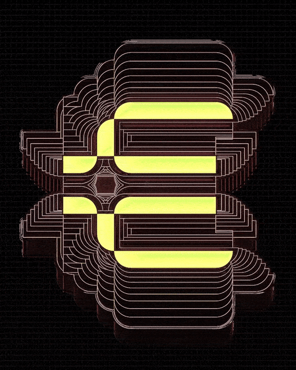

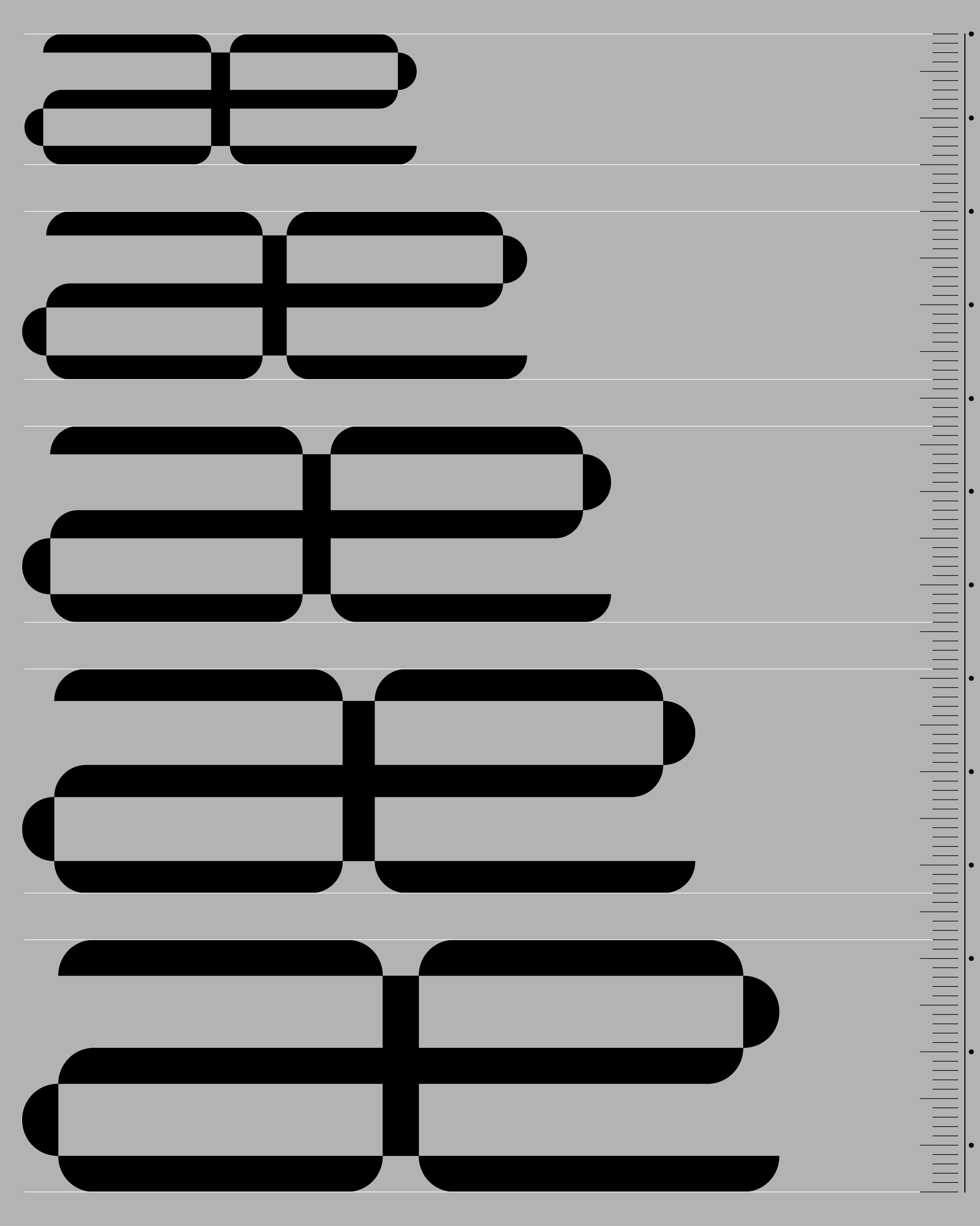
Ars Technica has several outstanding construction features, the most obvious being the overlapping of shapes and the interweaving of outlines.

Rationality in the construction of Ars technica starts from the unit of measurement of technology: the bit.
Since the technological world is built on the basis of the power of 2, we started from that exponential value to structure the upm (1024), stem thickness, and bend radii. We then defined the x-height, the caps height, and all the modules by working only with values multiples of 8 (23).
Since the technological world is built on the basis of the power of 2, we started from that exponential value to structure the upm (1024), stem thickness, and bend radii. We then defined the x-height, the caps height, and all the modules by working only with values multiples of 8 (23).
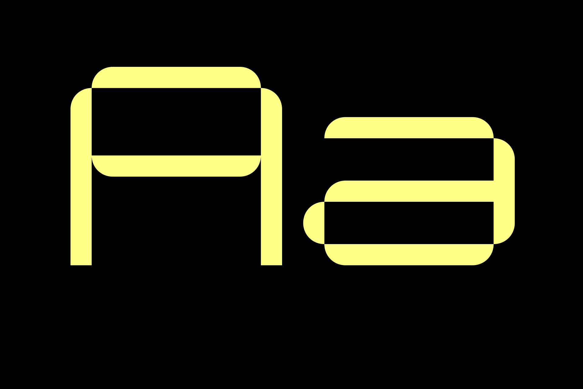

With the aim of maintaining the perfect word-framing during writing, two letter width modules were set: 704 em for single glyphs and 1408 em for compound glyphs.


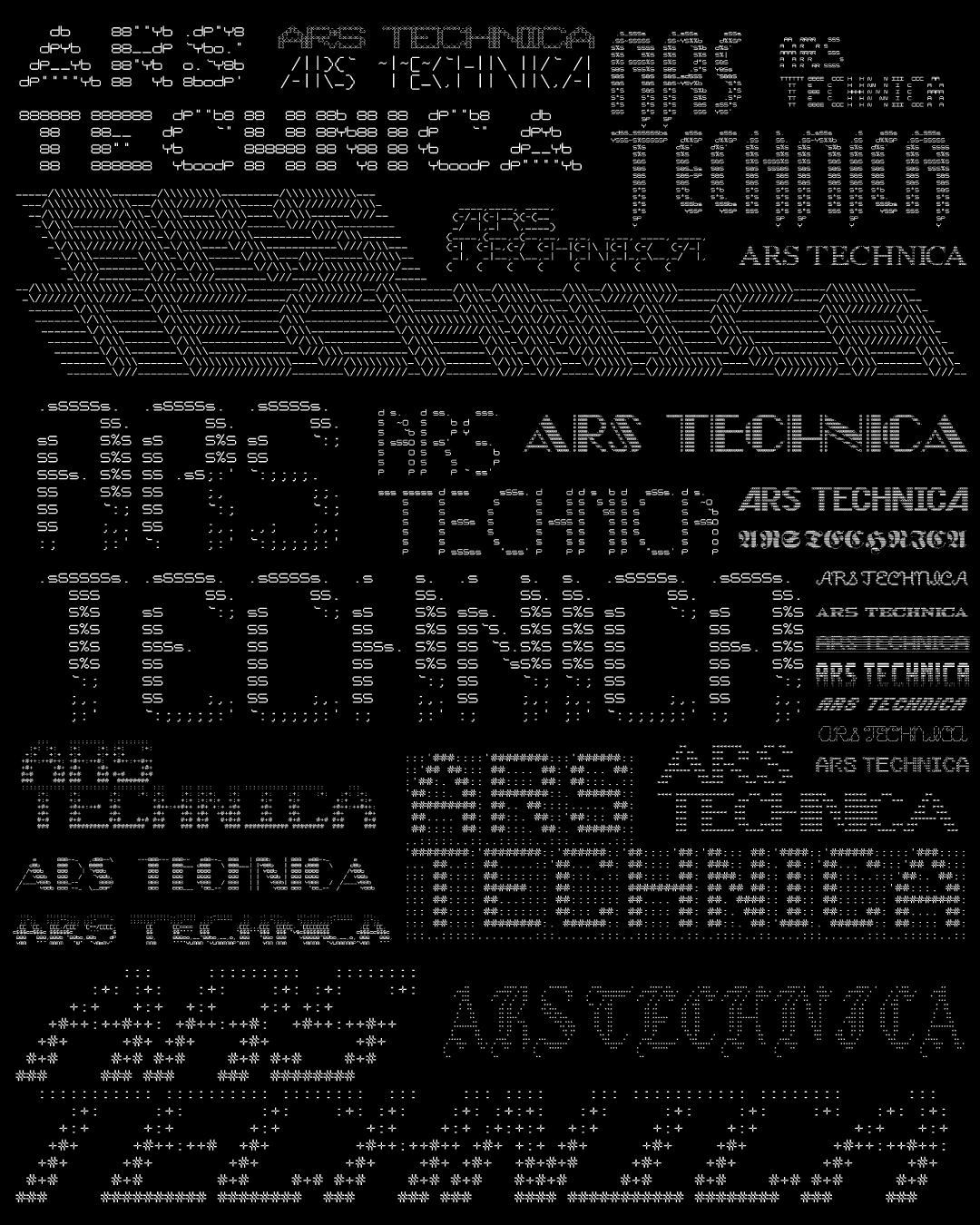
Despite being a font designed for large text, Ars Technica is perfect for visuals designed with macro/micro readability, associating large words with smaller informational text.
Of course its monospaced techno-approach is perfect also for visual designs in Ascii-art.
Of course its monospaced techno-approach is perfect also for visual designs in Ascii-art.

CREDITS
Motion design: Francesco Nobel
Motion design: Francesco Nobel