CHIKORIA
TYPE DESIGN

FOUNDRY: C-A-S-T
CAT: TYPE DESIGN
YEAR: 2023
CAT: TYPE DESIGN
YEAR: 2023
Chikoria is a typeface designed for headlines and large text, created with the conceit of fusing Italic calligraphy with oriental kanji, almost a script but with detached letters, super decorative and totally display.
Chikoria is available on CAST website.
Chikoria is available on CAST website.
Chikoria has several extraordinary features, the most eye-catching of which is the inverted thick/thin contrast. Unlike the Renaissance Chancery italics, here the imaginary flat nib has various angles with the letters showing thick parts top and bottom instead of left and right. Letters a, g and f (with a descender) cling to the italic tradition, but Chikoria’s slant is much greater than Chancery italics.
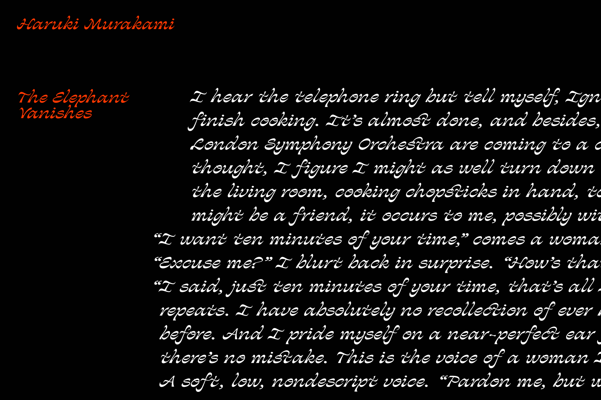
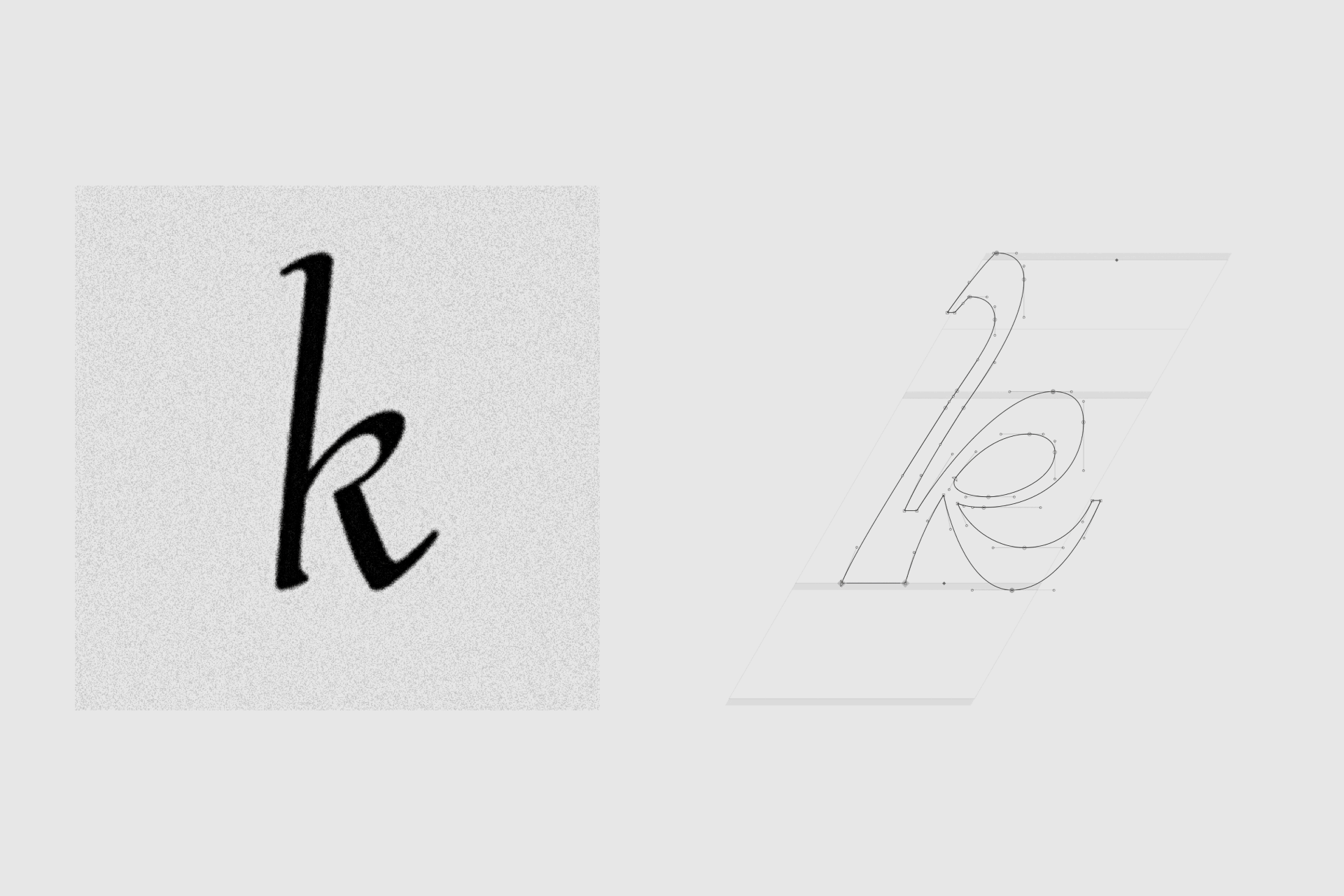
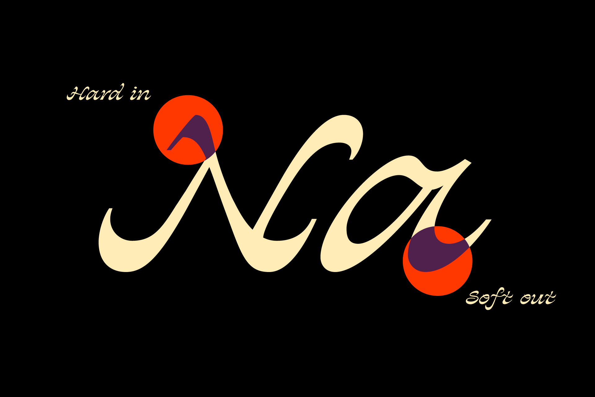
The inverted thick/thin strokes make whimsical letterfoms and add to Chikoria’s jaunty step. The hooked entry strokes, the tapered exit strokes and the smooth curves recall the flat nib or quill but also a pointed brush, as traditionally used in Japanese and other Asian calligraphy.

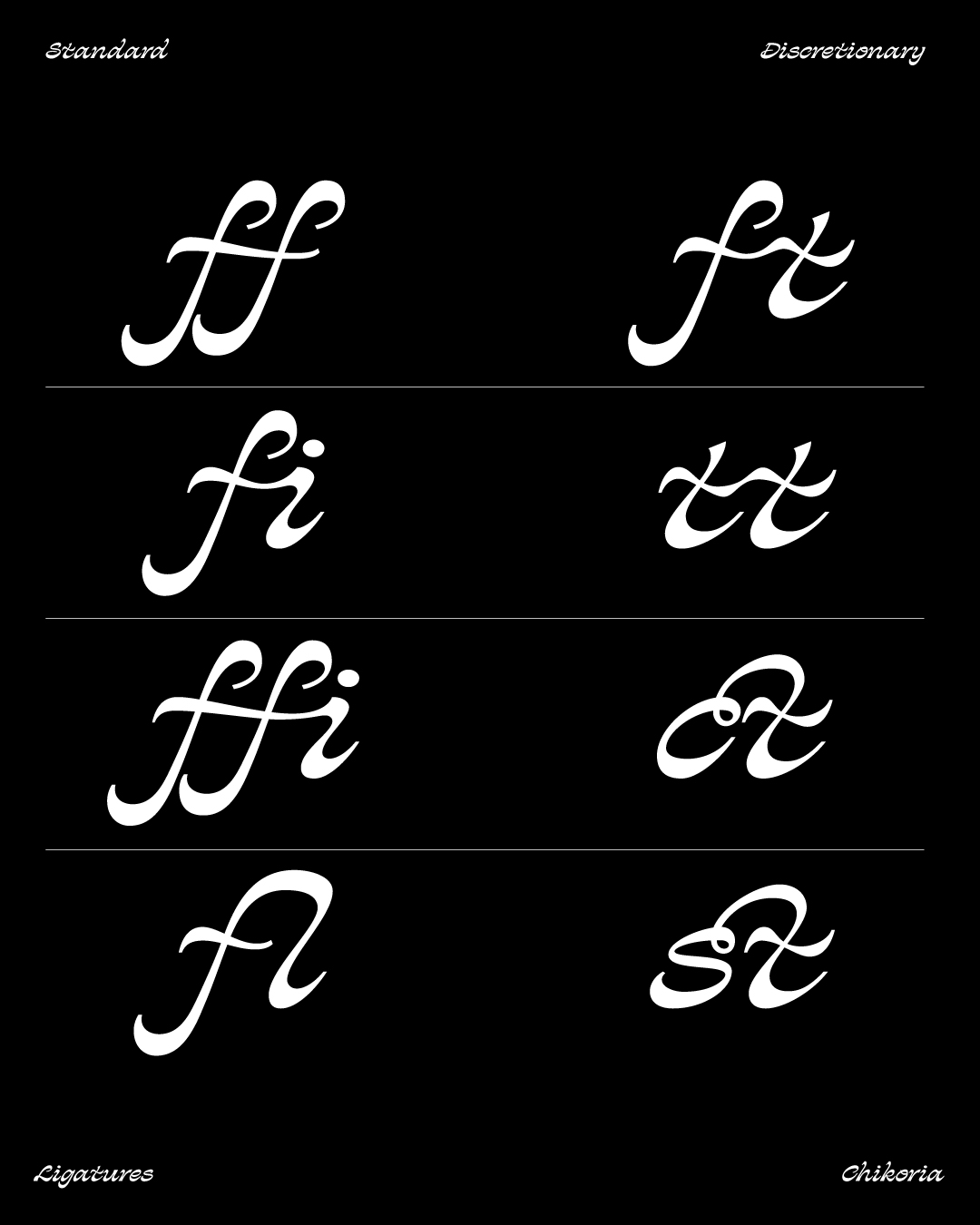
Despite its entry and exit strokes, Chikoria’s lowercase letters are not joined, except for ligatures ff, fi and fl. In order to balance the dark areas of all the letters, deep inktraps have been added where possible. The cursive uppercase letters have traditional proportions and work nicely with the lowercase. All of the unusual features of Chikoria make an energetic script face for titling and display.


CREDITS
Motion design: Alessandro Maffioletti
Motion design: Alessandro Maffioletti