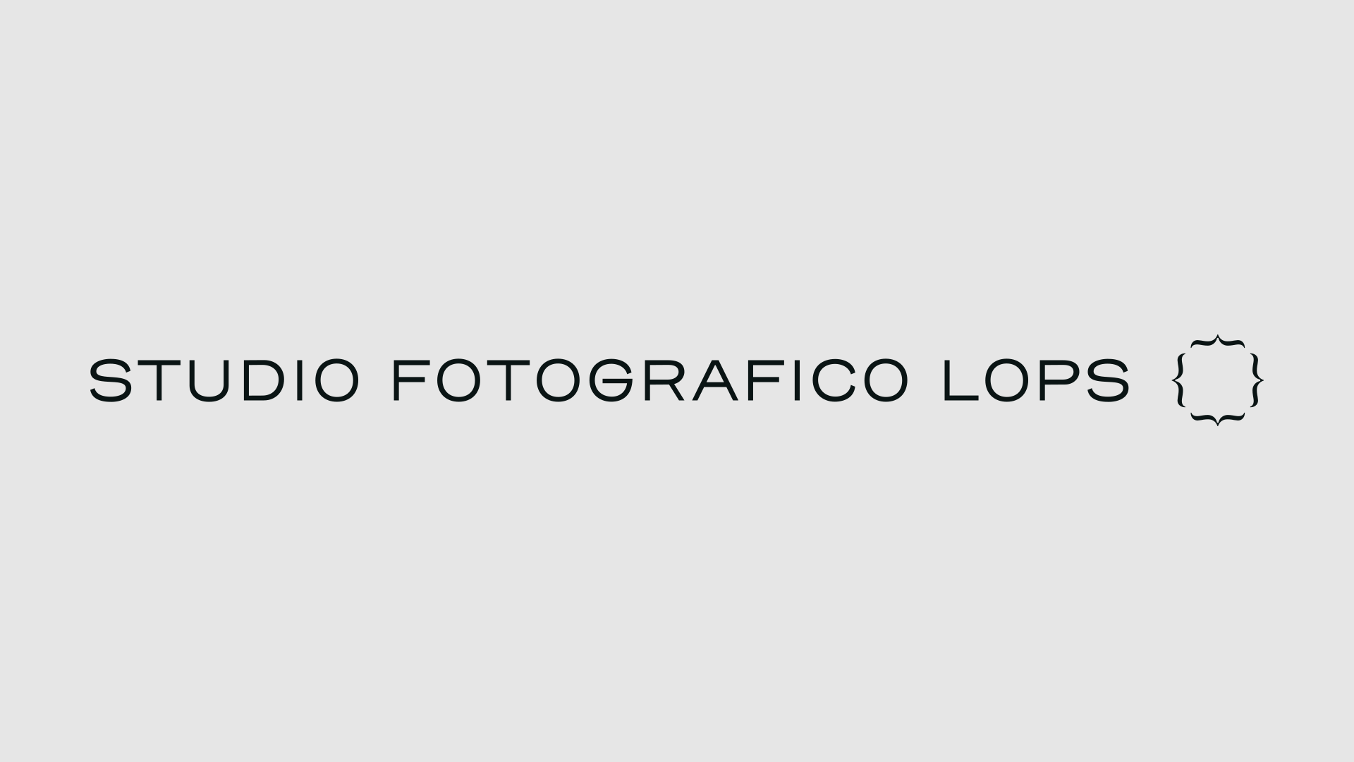
STUDIO FOTOGRAFICO LOPS
VISUAL IDENTITY - WEB DESIGN
CLIENT: STUDIO FOTOGRAFICO LOPS
CAT: VISUAL IDENTITY - WEB DESIGN
YEAR: 2022
CAT: VISUAL IDENTITY - WEB DESIGN
YEAR: 2022
Since 1986 Studio Fotografico Lops has been translating the character of people into images and telling their stories.
As early as the 1980s, Giuseppe Lops was among the first to favor a more spontaneous style and the use of natural light, bringing reportage into the field of wedding photography.
This allowed the studio to become one of the landmarks of Milanese photography and beyond. Forty years later his son Domenico, with a broader photographic background, carries on the work begun by Giuseppe, following the canons of photojournalism and portraiture and expanding the services offered by the studio. In 2021, to enhance this generational change, we were commissioned to completely restyle the studio.
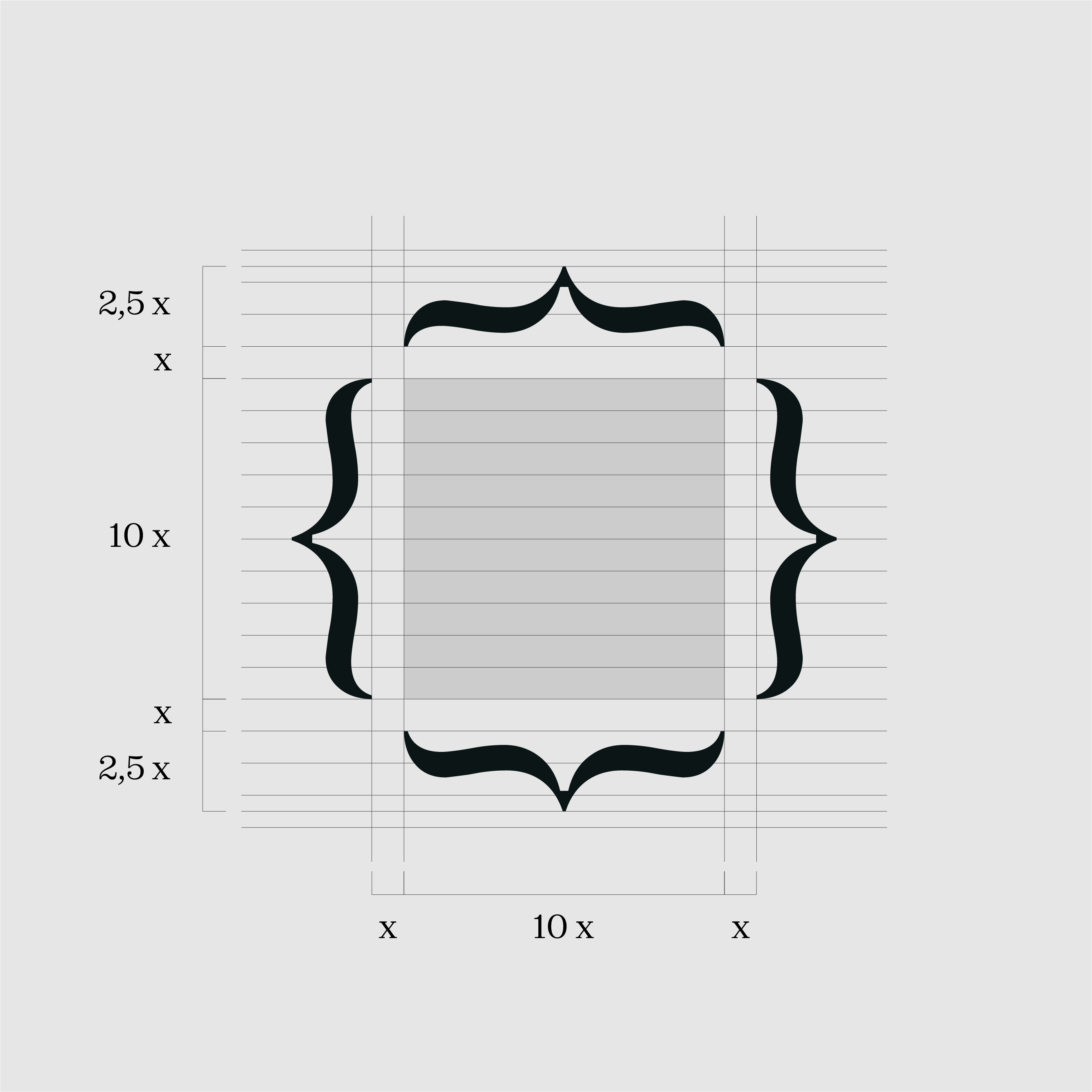

After analyzing the studio's archival materials and talking with Domenico Lops about its philosophy and working method, we identified two key words: images and people. The pictogram was born from the union of these two concepts, and if in a story the brackets enclose a specific moment, Studio Fotografico Lops through this symbol imprints in images the special moments of people. The pictogram was designed with possible digital and animated developments in mind. Thanks to the inktraps in the vertices, the movement will be more dynamic.


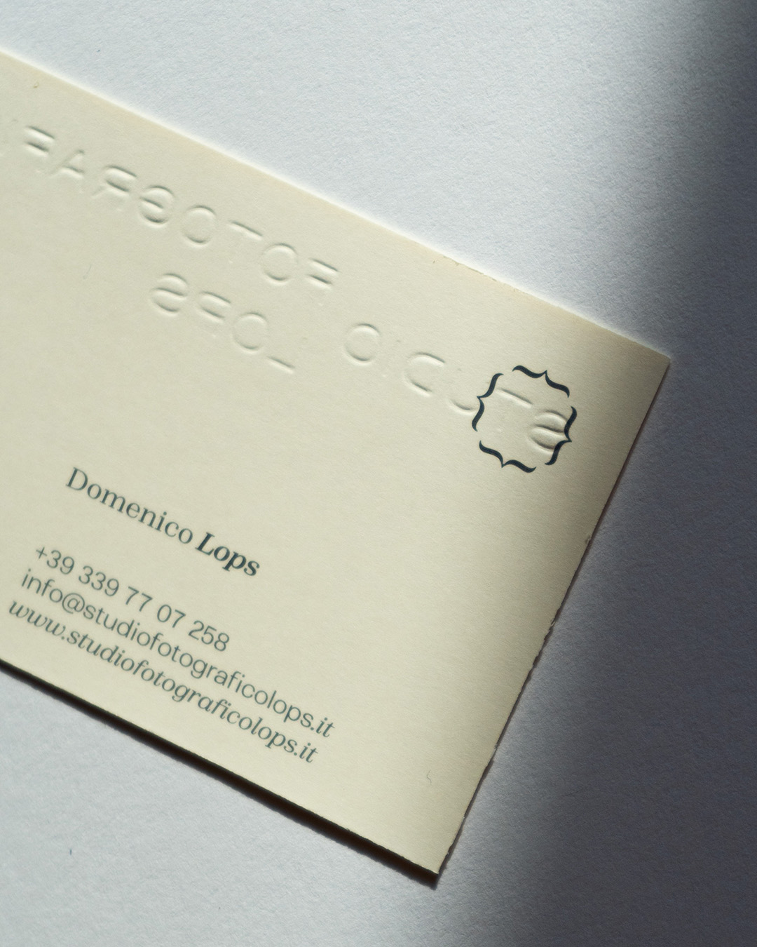
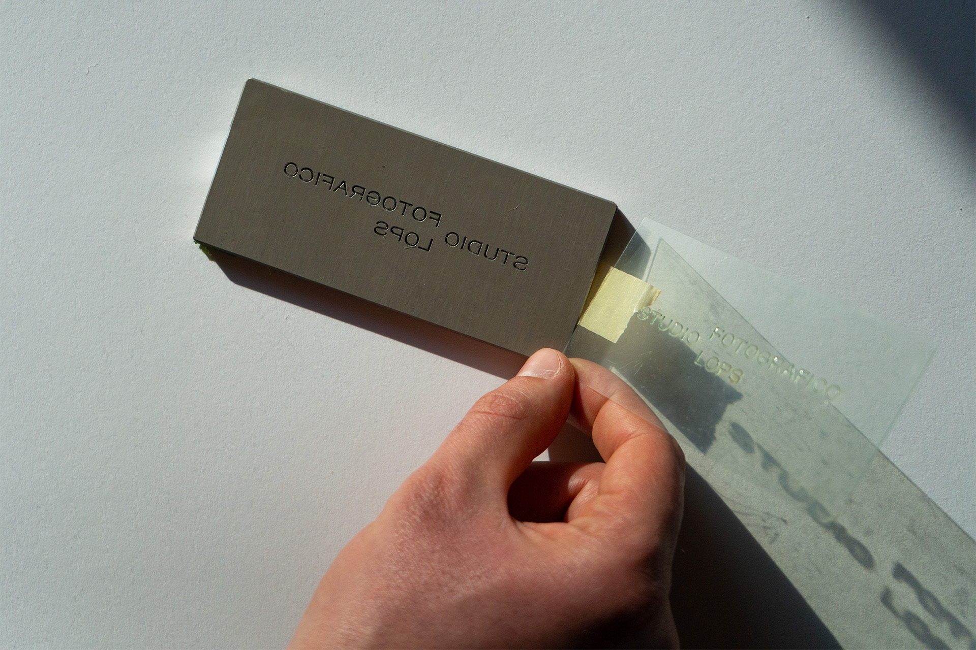
The first materials produced were business cards, printed on Fedrigoni 300g paper with embossing of the logo.
Thanks to the dynamic format of the pictogram, the most important information can be placed within it, thus making the communication more identifying.


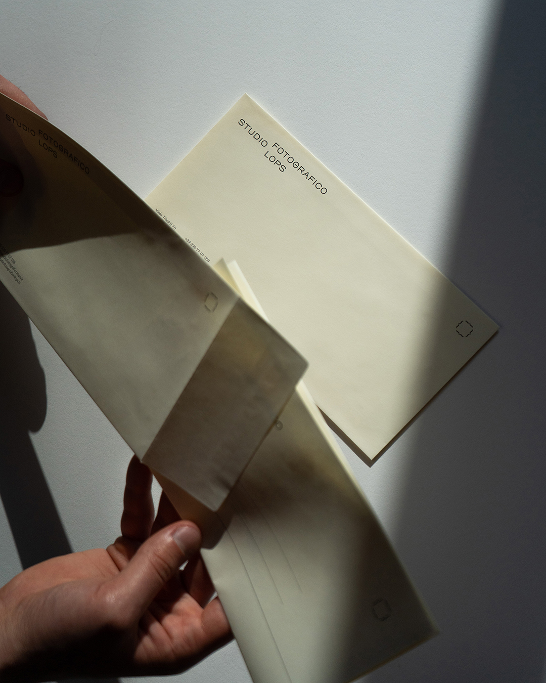

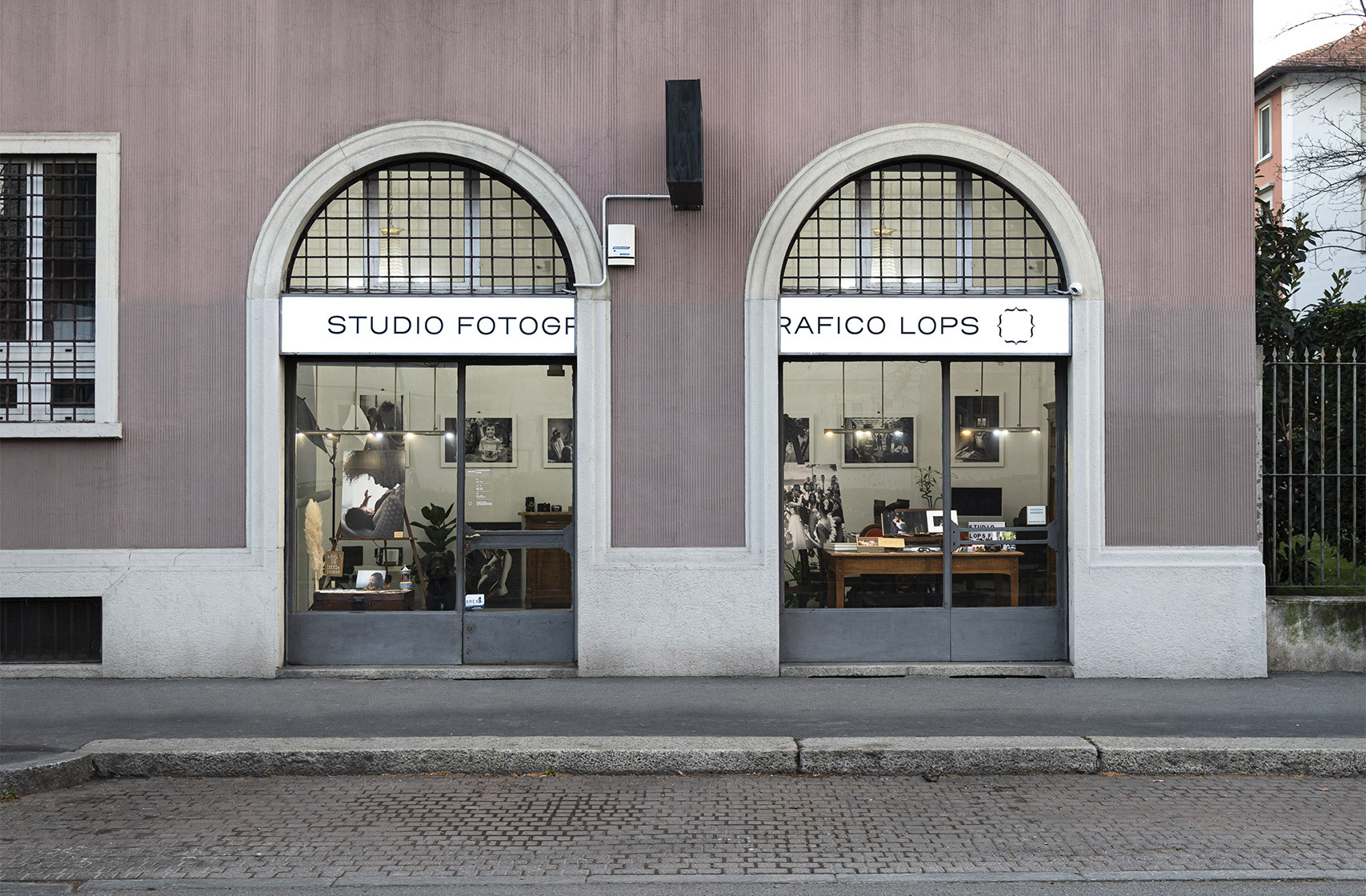
To meet the needs of the firm, a letterhead was designed and then adapted to two different documents: contract and price list. Next, we designed envelopes, creased photo folders, stickers and canvas bags. In order to make the new identity recognizable, we designed the firm's signs conforming them to the new communication rules and, thanks to the double window, we decided to position the logo exploiting all its horizontality.


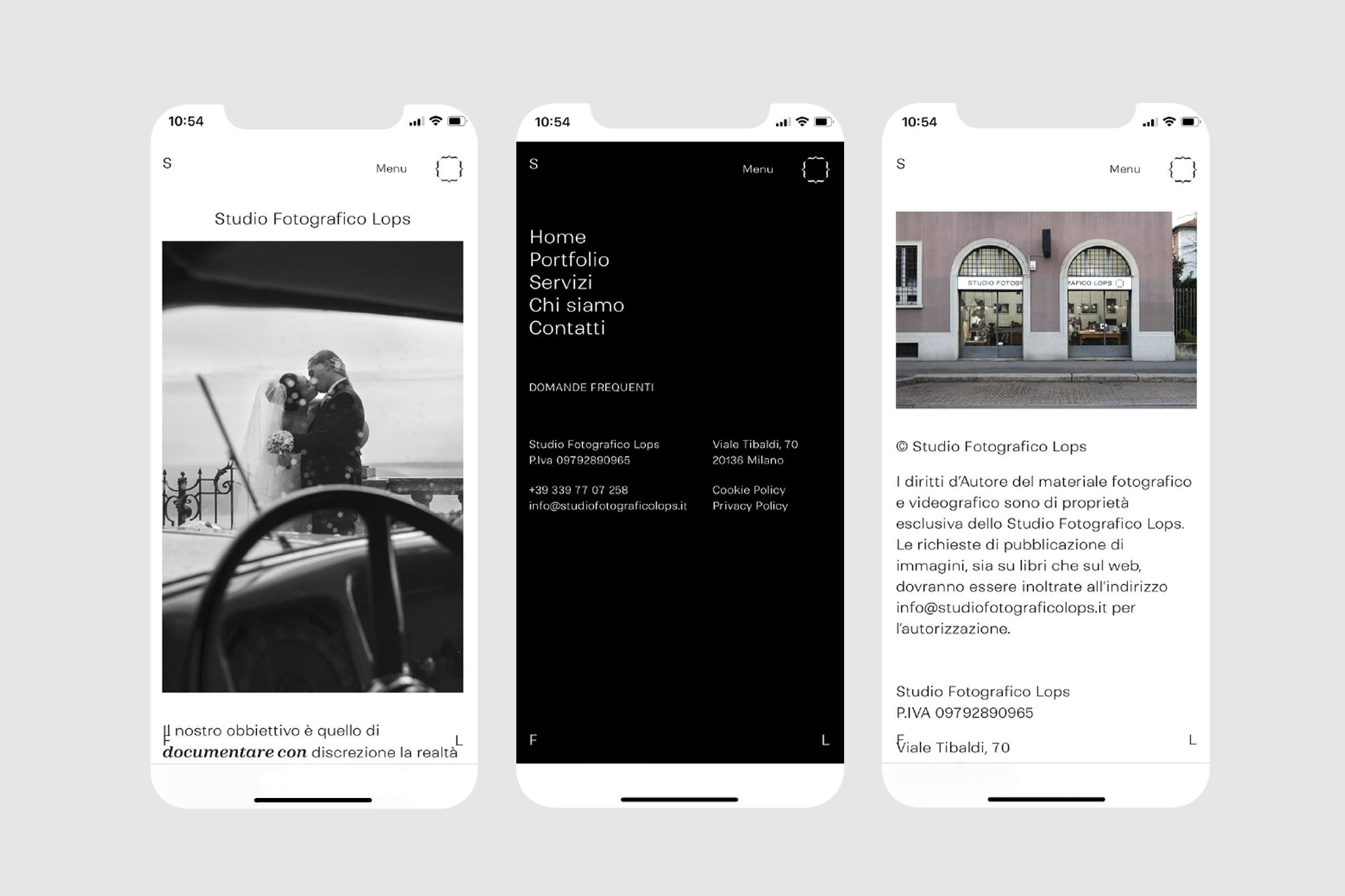
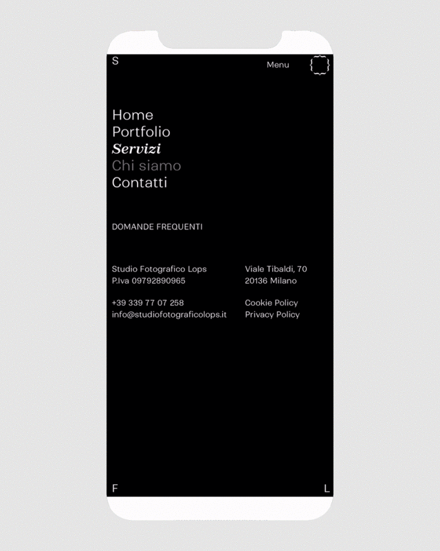
Finally, we unified the studio's digital presence by designing a new website. The goal was to create a fresh, contemporary tool that encapsulates the studio's best work while also enhancing its historicity.

CREDITS
Concept, Art Direction & Brand Design: Riccardo Riggio & Samuele Sala
Copywriting: Alessandro Vanossi
Web Development: Odon Airoldi
Print: Prograf di Francesco Formica
Concept, Art Direction & Brand Design: Riccardo Riggio & Samuele Sala
Copywriting: Alessandro Vanossi
Web Development: Odon Airoldi
Print: Prograf di Francesco Formica