TEDxLAKECOMO / EMERGENZE
CREATIVE DIRECTION - VISUAL DESIGN
CLIENT: TEDxLAKECOMO
CAT: CREATIVE DIRECTION
VISUAL DESIGN
YEAR: 2025
CAT: CREATIVE DIRECTION
VISUAL DESIGN
YEAR: 2025
“Emergenze” (Emergencies) is an ambivalent term that immediately evokes a sense of danger, but upon closer examination, it also takes on the meaning of “bringing to light.”
Overlapping sounds often characterise an emergency, such as noises, screams, and echoes. This concept inspired the visual identity I designed: a flexible system in which graphic elements move and overlap continuously, bringing out new patterns at every moment.
Overlapping sounds often characterise an emergency, such as noises, screams, and echoes. This concept inspired the visual identity I designed: a flexible system in which graphic elements move and overlap continuously, bringing out new patterns at every moment.


Andrea Crosta - Environmental Investigator
Vertical lines are the central element of this identity. Starting from the graphic concept of Scanimation, I developed a system in which lines and words merge, creating new images with every change of movement. This system has been applied to all communication material, both digital and printed.
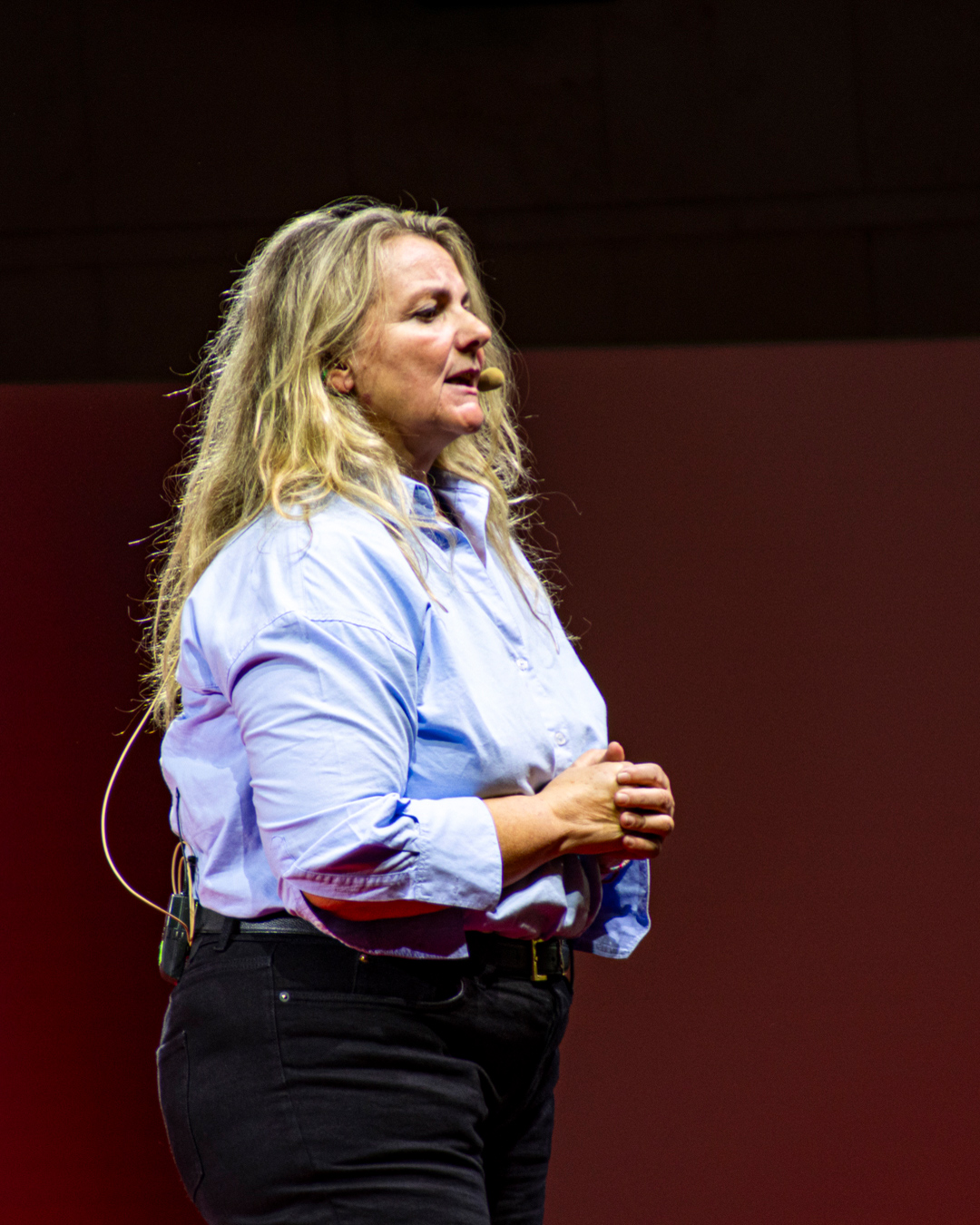
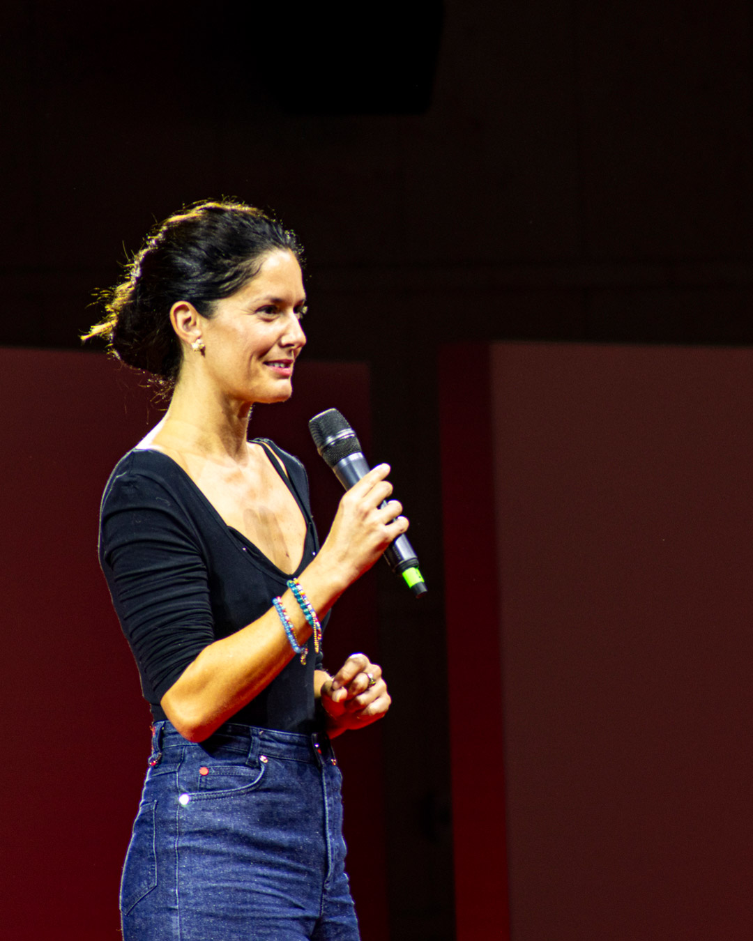
The entrance, presence, and exit of each speaker on stage were accompanied by animations in the background.
The entrance, presence, and exit of each speaker on stage were accompanied by animations in the background.

A loop of colored lines welcomed the audience through an animated portal.

Alessandro Foti - Immunologist and Researcher
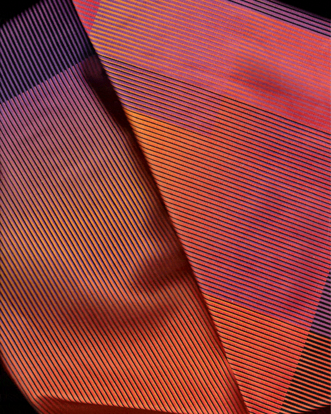


The colour palette departs from the classic “TED red” standard, as associating it with the theme title would have emphasised only the meaning of “danger.” Warm, vibrant colours were used to convey positive and appealing feelings.
The overlapping concept helps to create different visual layers.
The overlapping concept helps to create different visual layers.


To give concrete form to the concept of overlapping, transparent paper was used for the program, allowing the overlapping content between pages to be seen.
The format of this document is vertical, following the direction of the lines and the overall graphic concept.
The format of this document is vertical, following the direction of the lines and the overall graphic concept.

Alessia Canfarini - Innovation Doer


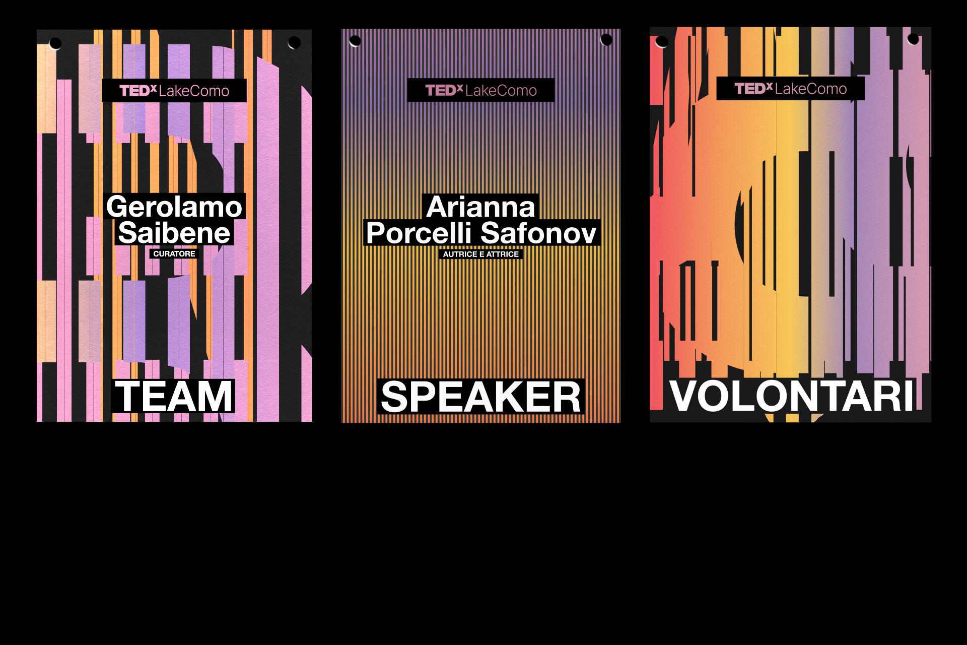
Customised T-shirts, badges, and lanyards were also produced for the team, volunteers, and speakers, and bookmarks were given to the public.

Arianna Porcelli Safonov - Author and actress

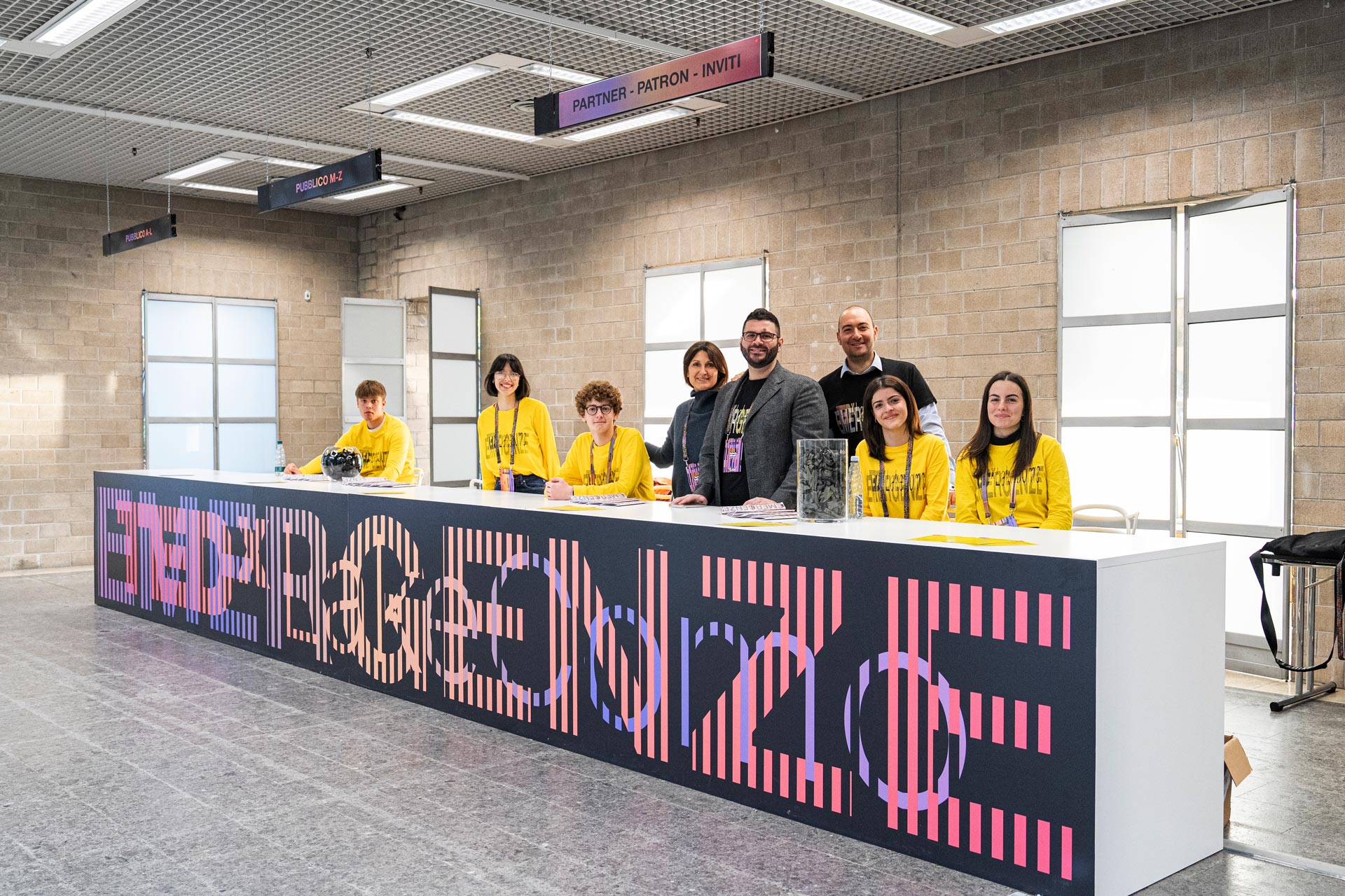
The visual identity has also been applied to all signage, from the entrance to each area of Villa Erba.

Nello Scavo - Journalist
CREDITS
Motion design: Francesco Nobel / Davide Perucchini
Editorial support: Renato Bianchi
Photography by: Federico Galimberti
Video footage by: Marco Schenoni
Thanks to the TEDxLakeComo Dreamteam
Motion design: Francesco Nobel / Davide Perucchini
Editorial support: Renato Bianchi
Photography by: Federico Galimberti
Video footage by: Marco Schenoni
Thanks to the TEDxLakeComo Dreamteam